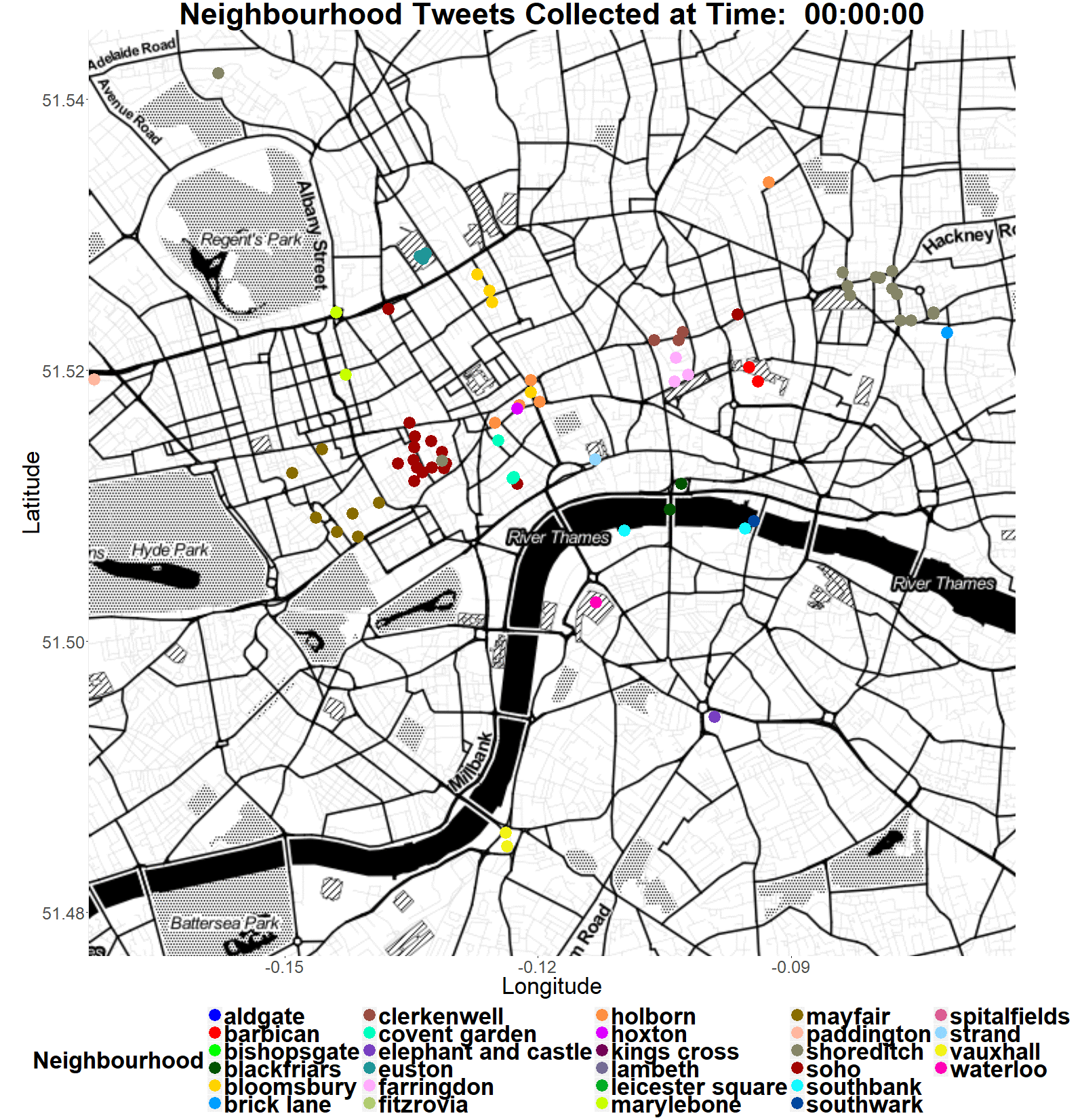
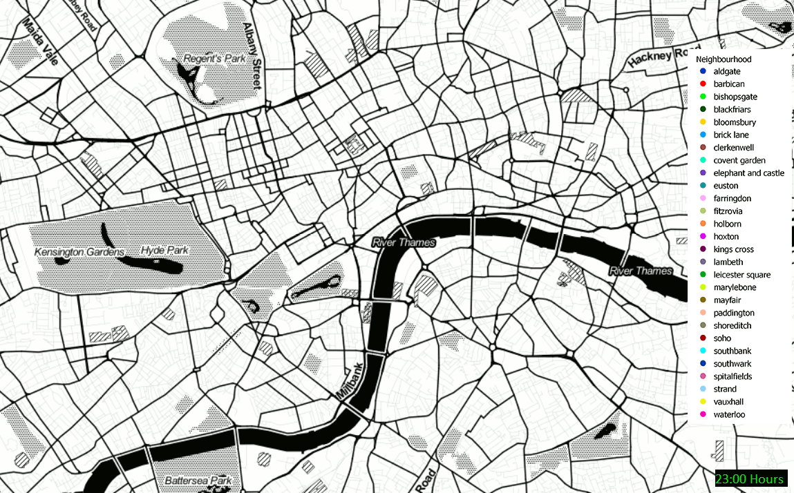
In my last post I looked at spatio-temporal data with the QGIS Time Manager plug-in. I thought it might be useful to now make a comparison between the Time Manager and R’s gganimate extension. gganimate allows you to create animated versions of ggplots using a “frame” (a time data attribute) as another aesthetic. This means that the time values can be added to the way a plot looks, just like you might add colours or an x and y axis. For this example, I’m using some Tweets which I harvested to explore vernacular geography in London, specifically, which neighbourhood people think they are located in. Each Tweet is time stamped and has a latitude and longitude so is perfect for investigating spatio-temporal distributions and looking for patterns and relationships. For both examples I’ve used just the hour that the Tweets were sent, so that we can see a progression of Tweets as they were sent throughout the day.
The first example was created with the QGIS Time Manager:
This second example was made with the gganimate extension of the ggplot R library: