This week I’ve been thinking about how to represent changes over time in GIS. It’s traditionally been tricky and time consuming to visualise spatio-temporal data and to track changes in a spatial phenomenon over time. It’s mostly been done by using a series of static maps and altering styling and symbols to display changes over time. This has meant that we’ve often seen the temporal elements of geospatial datasets ignored.
However, in recent years there has been great progress made in the usability of GIS as well as in tools for animation and video/GIF formats. These factors coupled with the ongoing trend for creating beautiful data visualisations has bought about exciting new ways to look at spatio-temporal data. These advancements have mostly been driven by open source software and user derived libraries and plug-ins.
Probably the first stop for spatio-temporal data presentation and exploration is GIS is QGIS’s excellent Time Manager plug-in.
The plug-in allows you to create a set of time-stamped images which can then be compiled into a GIF or Video. The Time Manger dashboard is very intuitive, you might just need to do some data pre-processing to get it into the correct time format and also some post processing in a graphics editor, I used GIMP.
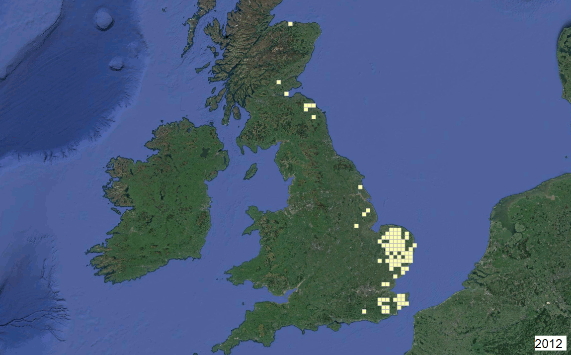
For my first attempted I looked at some open data from the Forestry Commission concerning the Chalara dieback of ash trees.
It’s a fugus that arrived in the UK from continental Europe and can cause ash trees to deteriorate and eventually die. It’s been of huge concern since it was first detected in 2012 and since then a great deal of research has been made into the spread of the fungus and into ways of curtailing the threat.
The animation below, which I created with the Time Manager, shows the progress of Chalara through the UK from 2012 to 2017. The pattern of spread of the fungus is made immediately obvious as each year sees it’s progression further west.